top of page


"The Shelter"
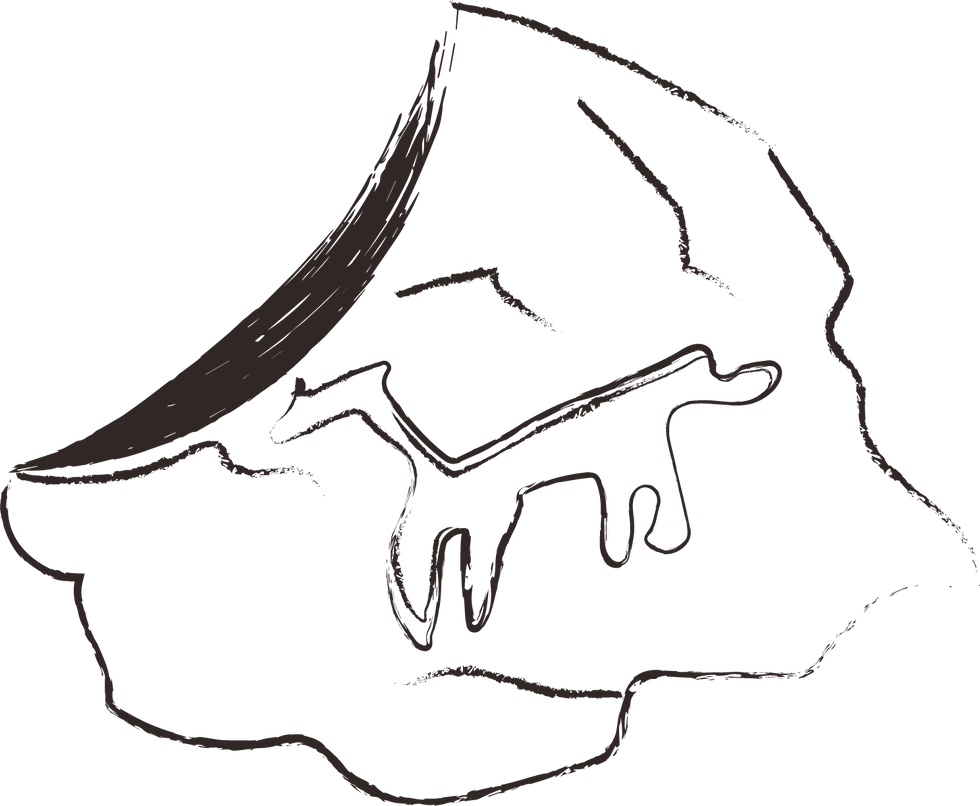
The logo is designed to morph into imagery and iconography that represents culturally significant products, traditions, and attractions from the province of Chang Shun.

Client: Chang Shun Province, China
Project: Develop a brand identity to catalyze tourism in this growing province in the interior of China, unify the province under one visual system, highlight the unique offerings to tourists, and produce clear messaging to potential tourists.
Details

Logo

In this branding project for Changshun Provence in China, we didn't want to bulldoze the existing visual culture, so we created a logo that could become a framework for other visuals to live within.
(Our design is in red, with potential local artwork and text in empty spaces.)
The System
bottom of page